Bruscos- Brand Identity, Graphic Design
- Brand Identity, Graphic Design
Brand Identity, Graphic Design
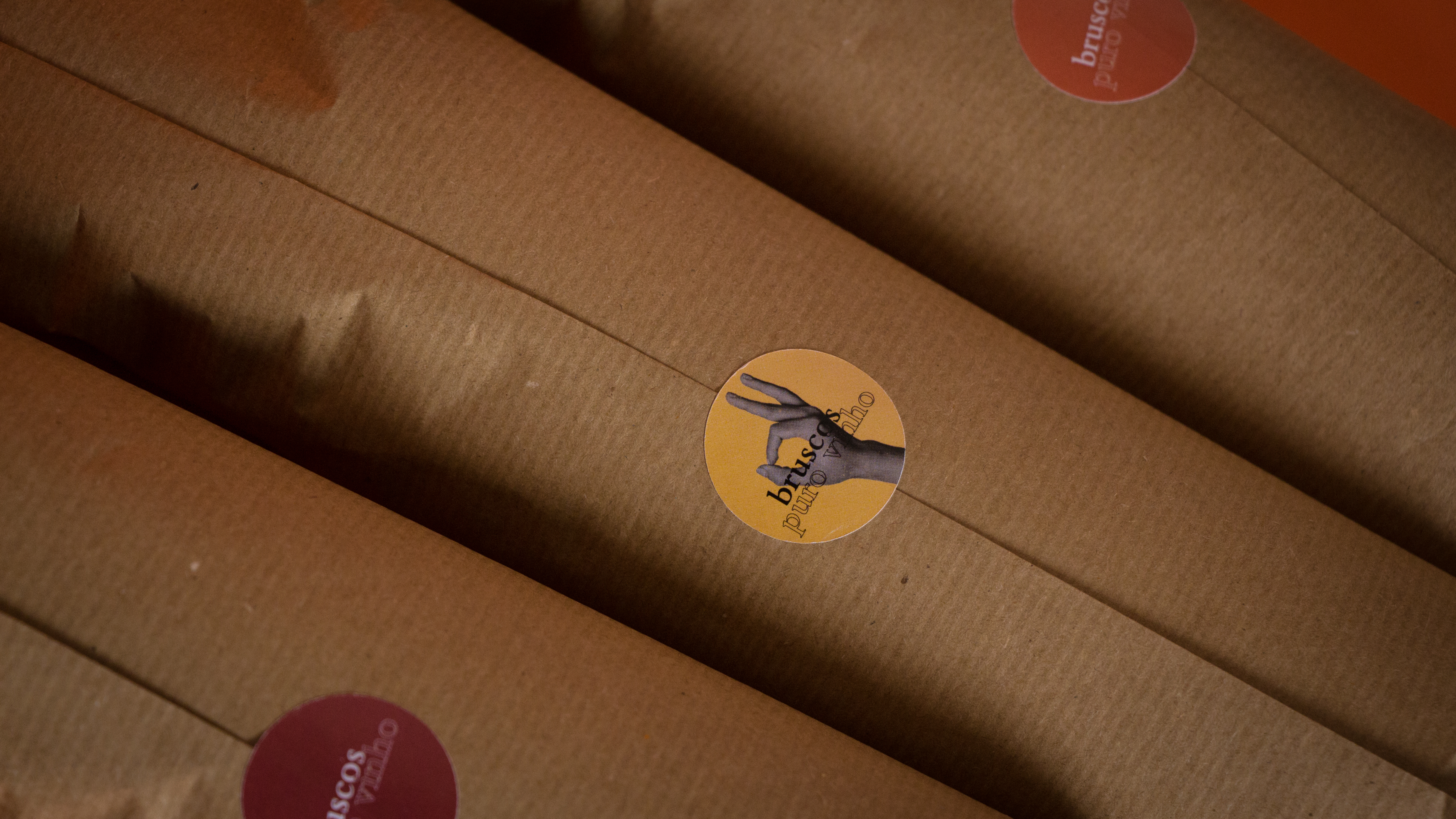
Bruscos
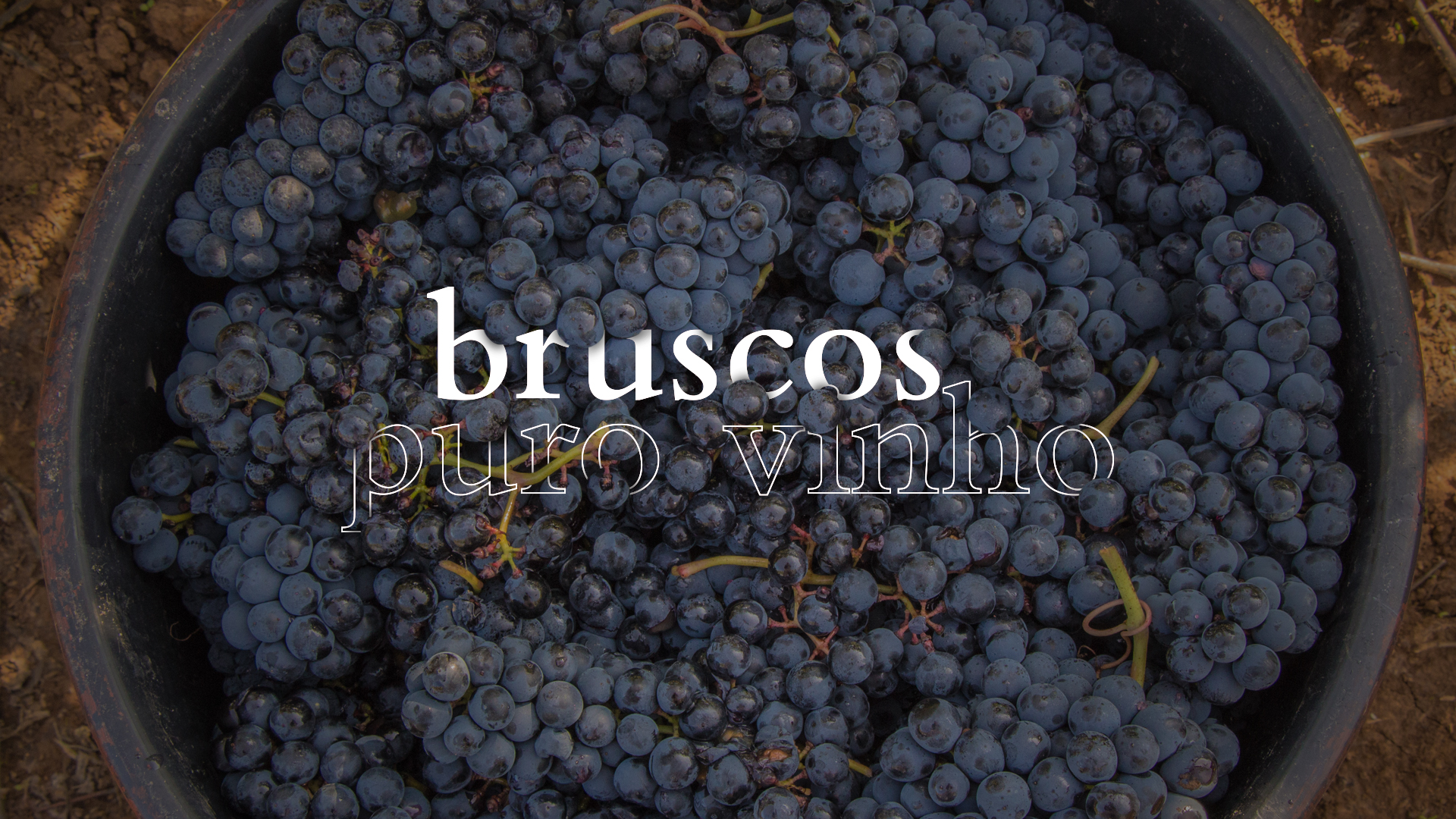
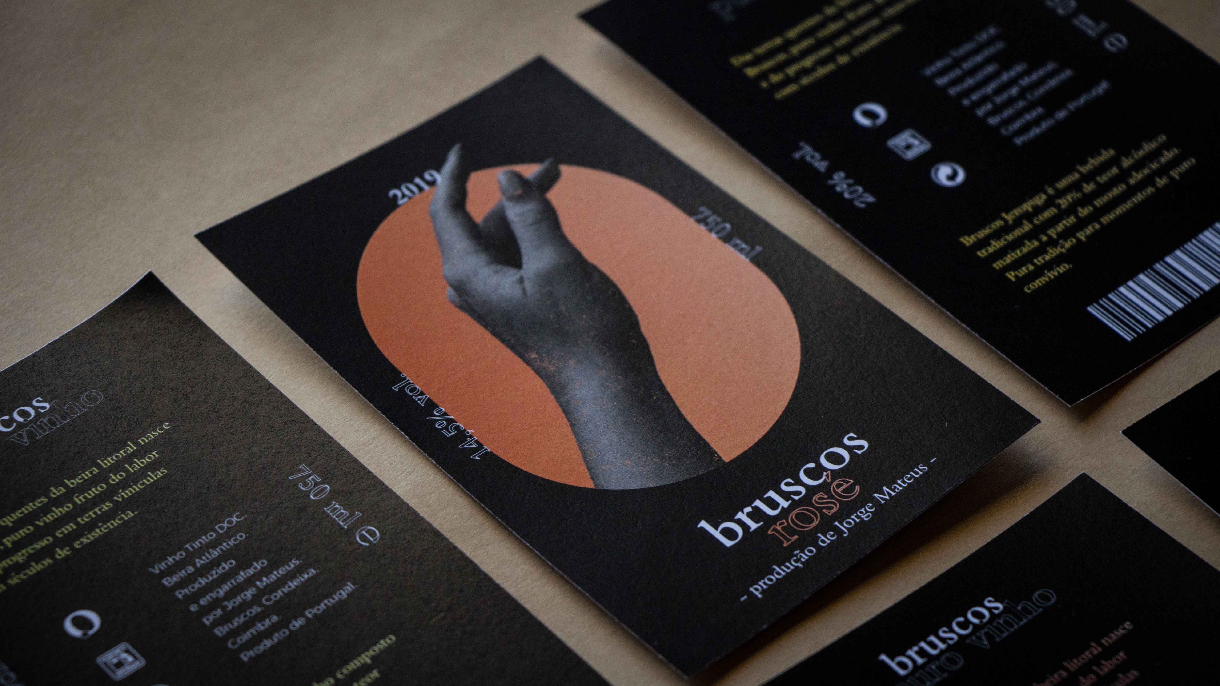
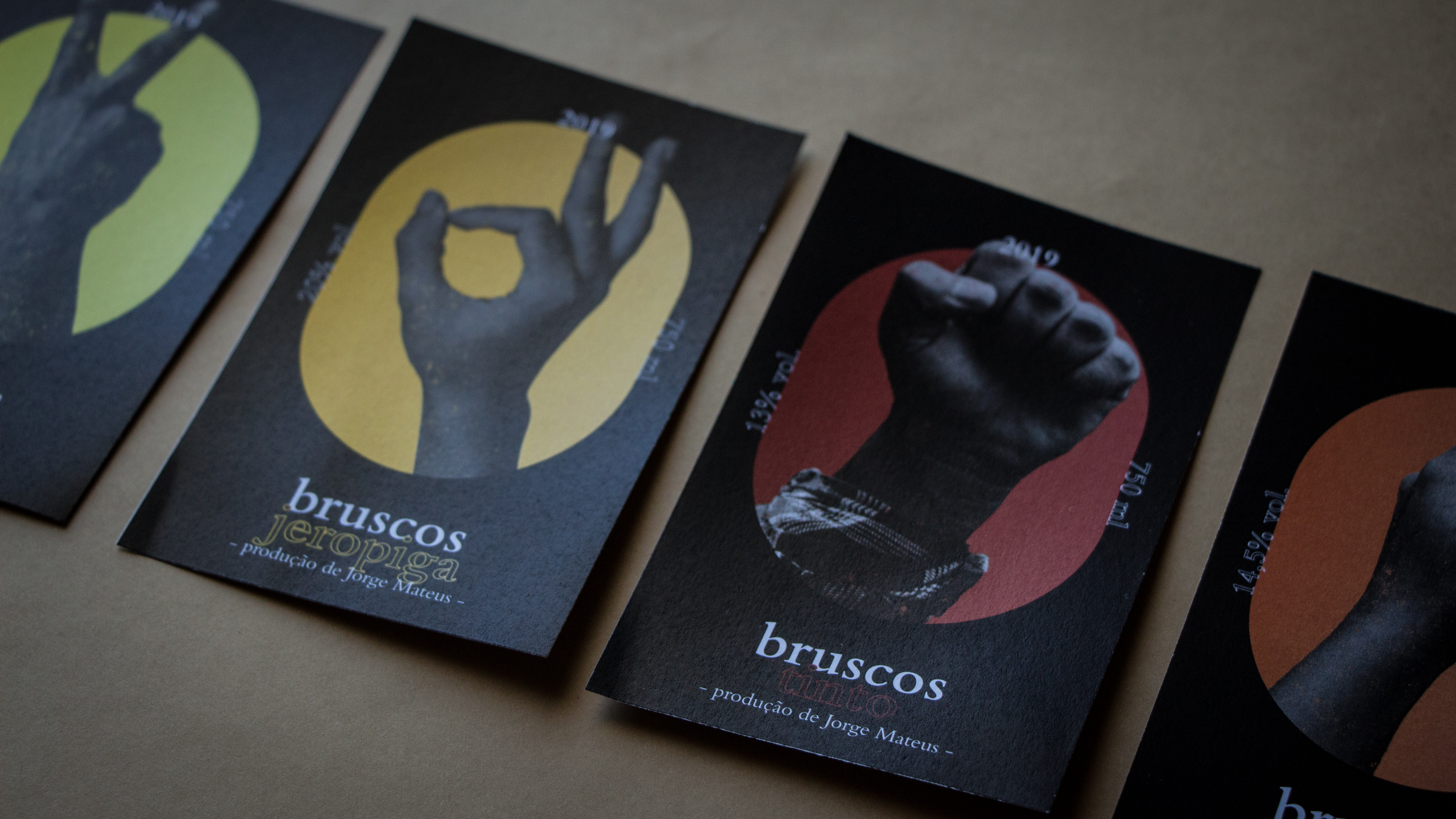
Packaging and brand identity
for Bruscos - Puro Vinho.
Keywords: wine, village, nature, hard work, pure wine, bio.
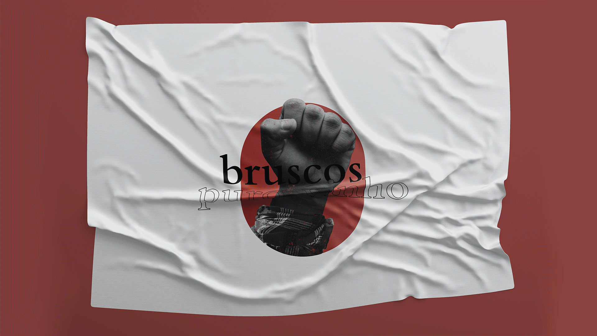

The visual identity was designed to bring together two ideas that distinguish Bruscos: the class and elegance of wine, and the work,
resistance and progress of a small town, sometimes forgotten and overlooked, but always humble and with a lot of respect
for its history and roots.
Through the classic typeface,
the modern contrast between the filled name and the stroked claim, and the use of gradients,
we established Bruscos and the quality of its wine in an image.
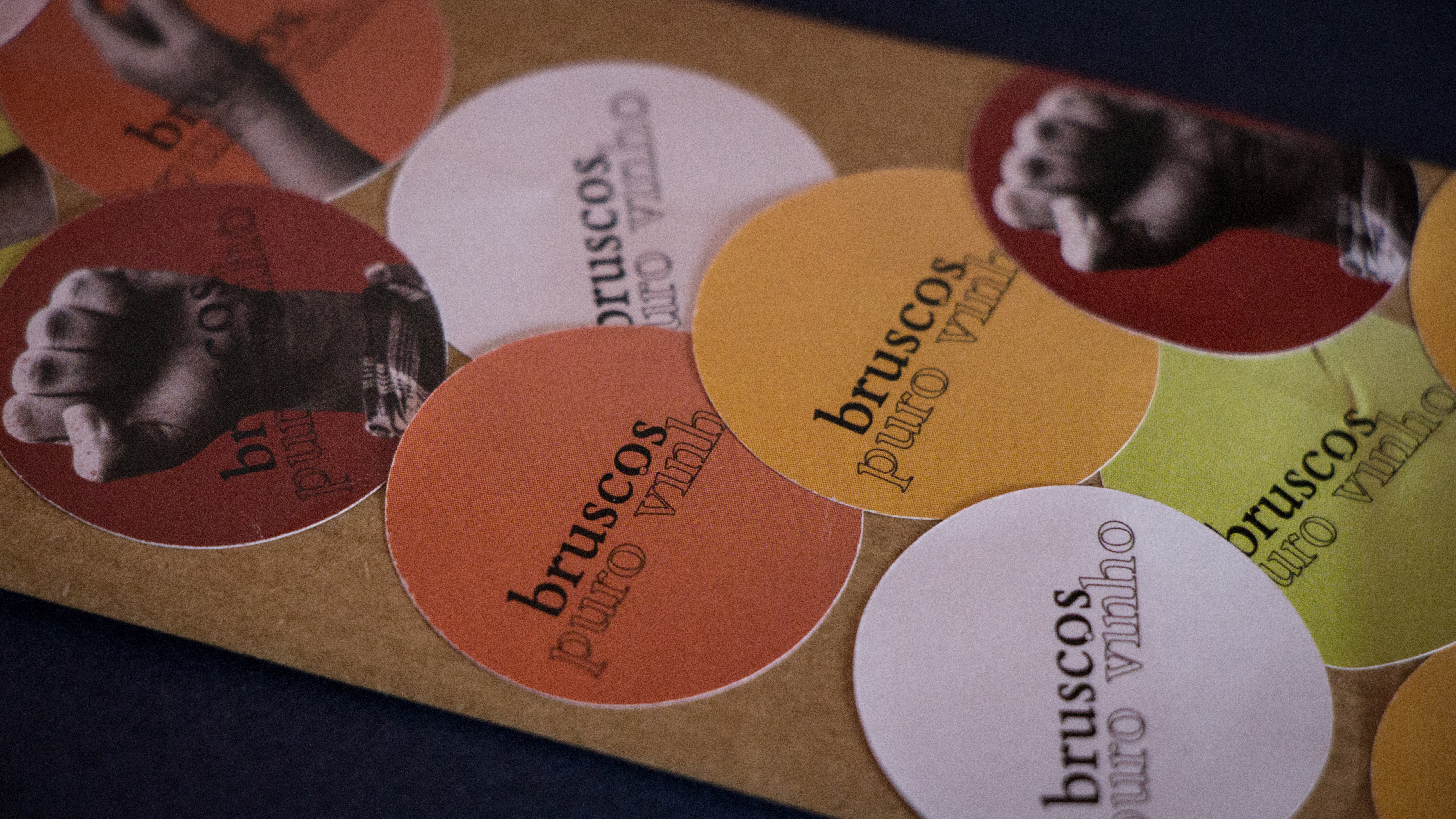
The symbol is born from the familiarity and celebration present
in the process of wine: the harvest, a human practice where the grape
is collected and falls into the bucket.


One of the practices that remains in memory, after visiting or experiencing Bruscos, is the proximity between the population.
As a small place, a village in the district of Coimbra, it is natural (and charming!) all people know each other and live together.
In this way, the action of greeting is the result of a daily, healthy and friendly connection.
Even in the distance, meters away,
"hello" and "good morning" are never forgotten.
Through manual gestures, the sense
of community is renewed daily.
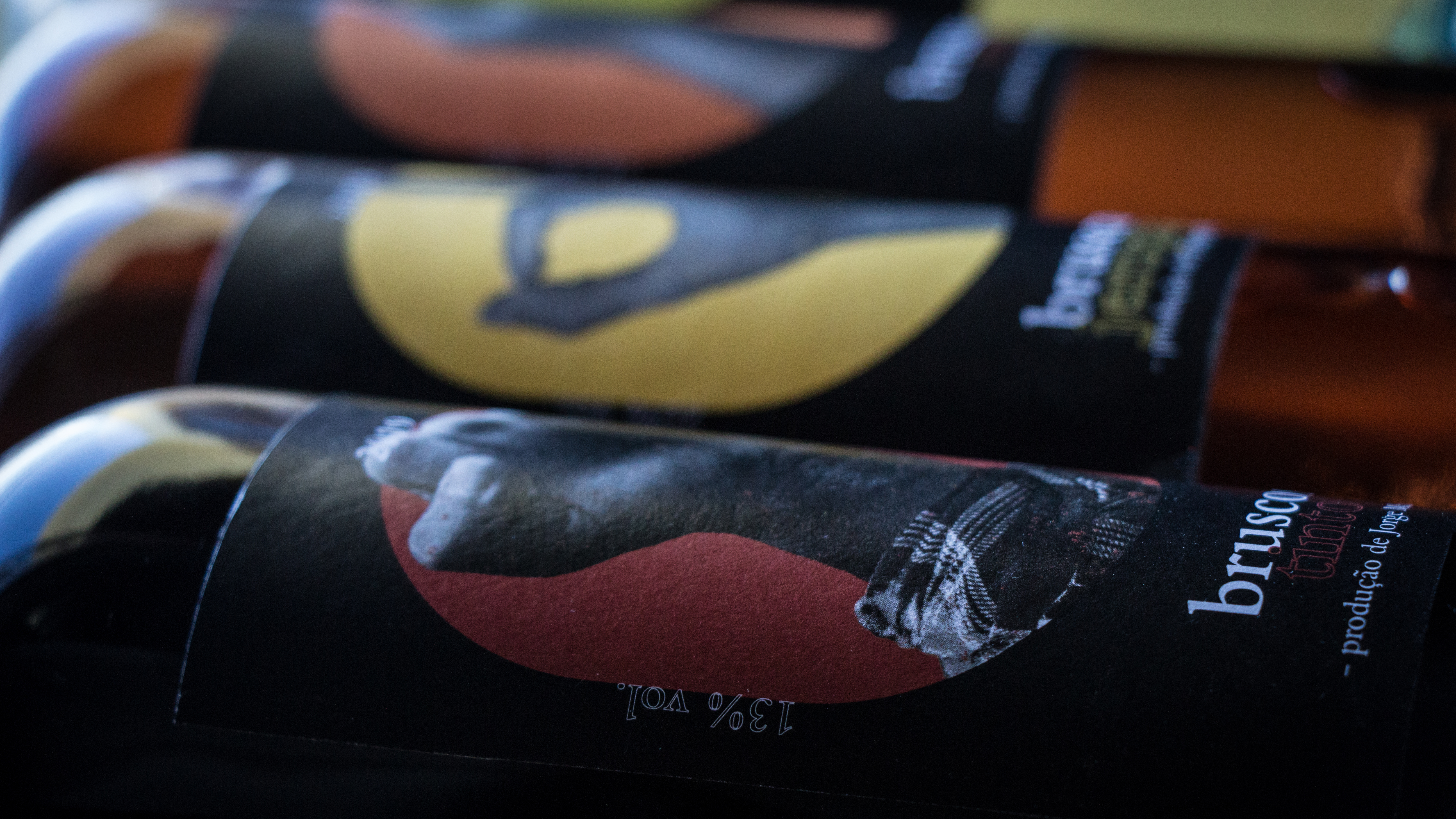
Based on this strong communication in the community, different manual gestures were defined to identify the four types of wine:
the closed hand, a symbol of robustness, strength and resistance, suitable for red wine; the peace symbol indicates a smooth
and free wine like white wine; the serenity, quiet and elegance of the gesture that distinguishes rosé wine; and the perfect,
ingenious and impeccable sign to identify a spiritual drink like Jeropiga.
The colors were chosen based
on the pigmentation of the wine.